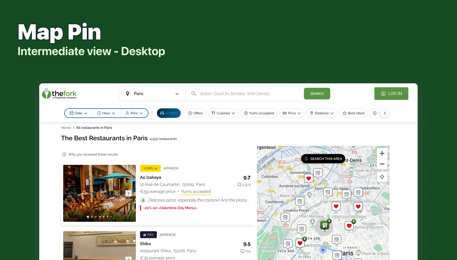
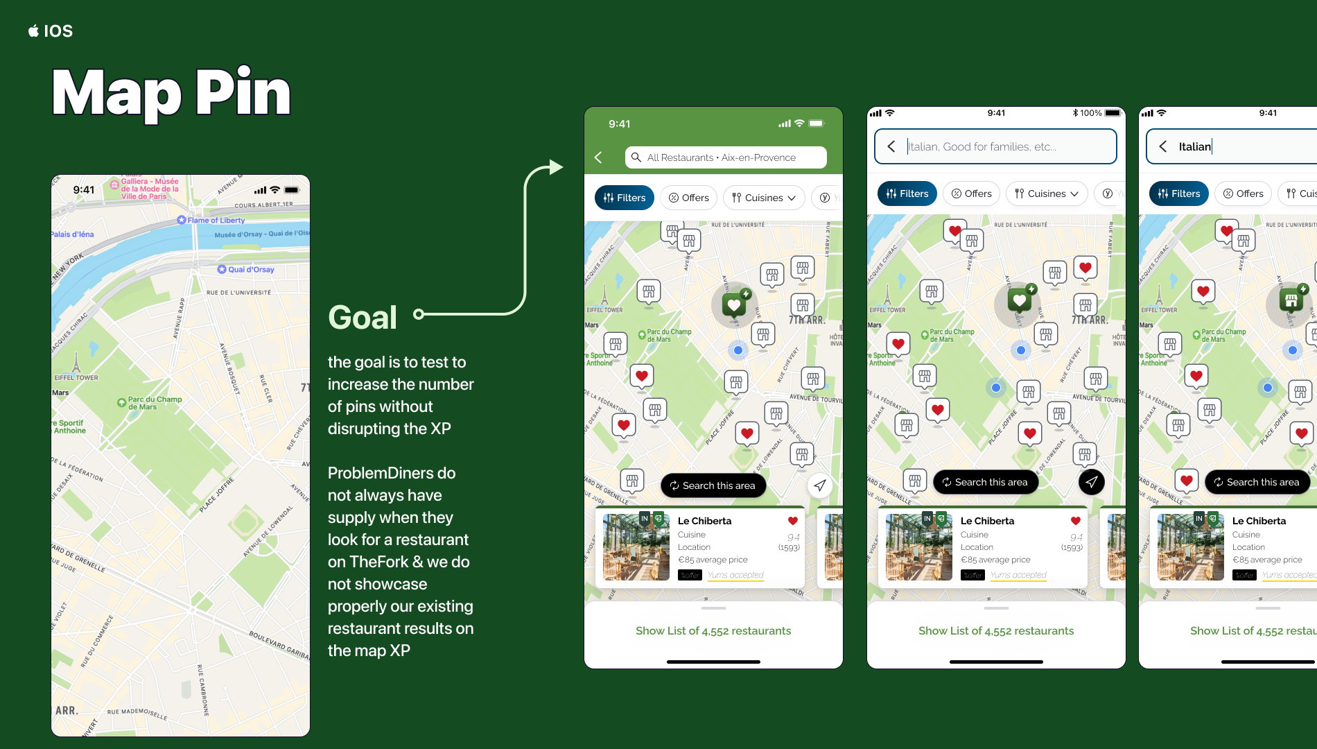
Diners do not always have supply when they look for a restaurant on TheFork & we do not showcase properly our existing restaurant results on the map XP
Users do not always understand there are more than 15 restaurant results on the geographical map zone because of map pins display (they have to scroll the carousel to see the batch of results mentioned on the SRP list)
We cannot increase the number of pins without disrupting users' map XP because the map space is constraint: more we increase the number of map pins, more pins overlap which creates reading issue
20% of sessions use the map XP >> improve their XP
Engage the 80% of sessions that do not use the map yet to maximise CTR RP & CVR
Expected Impact
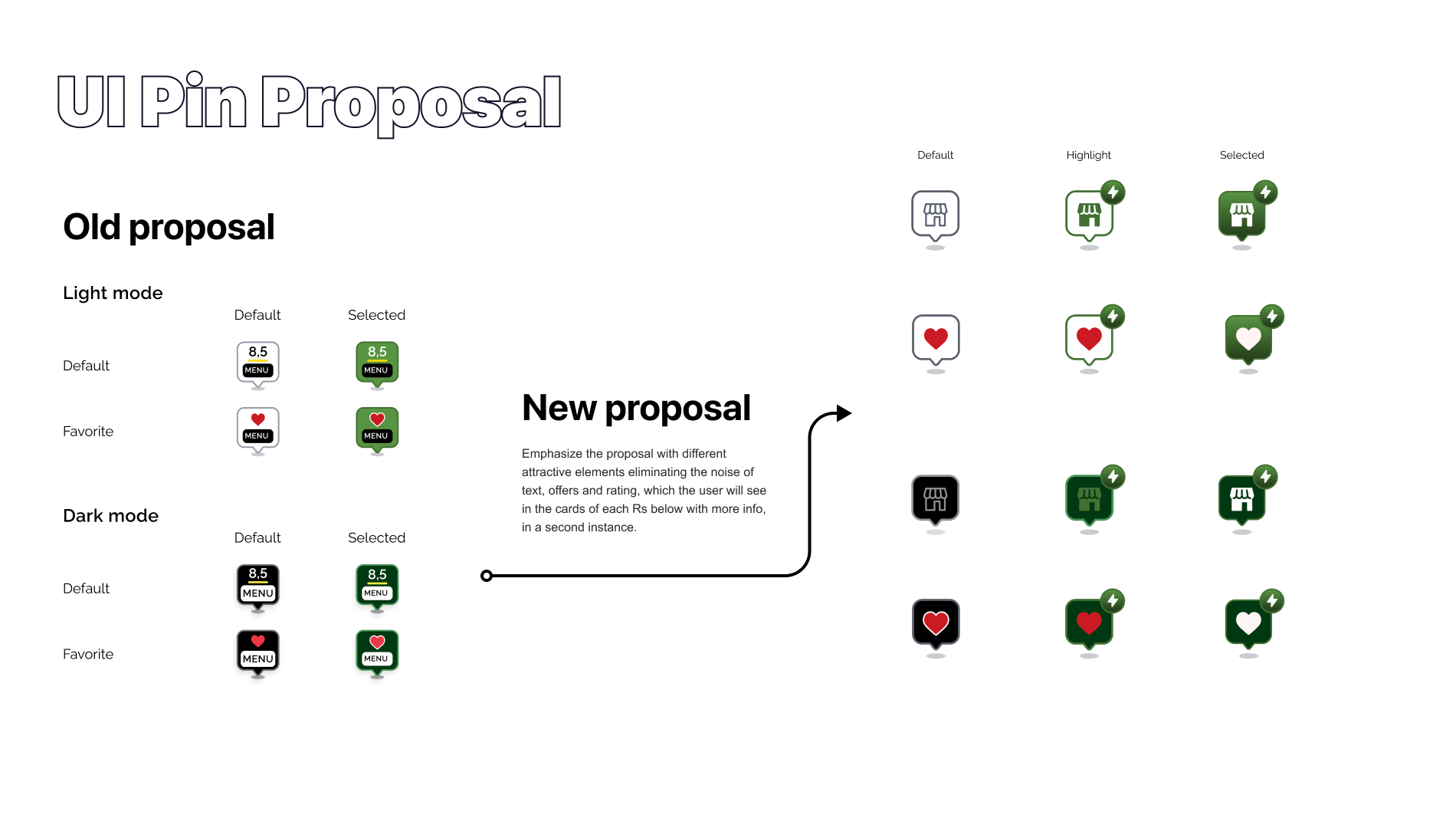
A symbol to show the location of an object, place or point of interest. show a key metric, performance indicator or even additional information.
Showing the location of an object is one of the most important and powerful functions of a map. The marker helps pin-pointing this location and establishing a connection to additional content.
Use when the content of multiple markers is important to make a decision and needs to be seen at a glance. Typical examples are ratings, offers, without the need to open an restaurant page first.
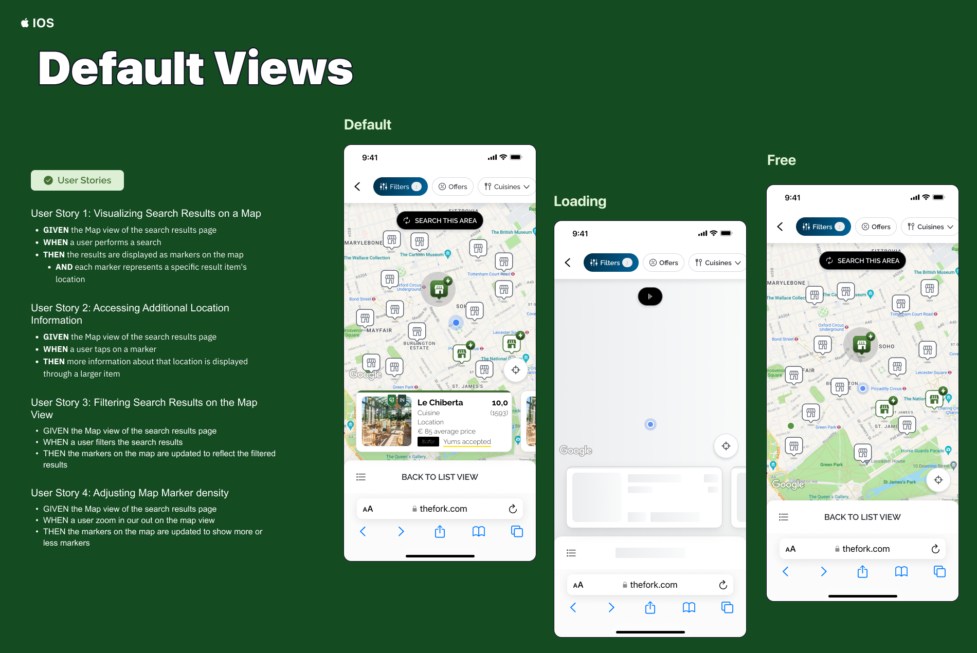
● Pins should be big enough to be clicked on, especially on Mobile. Primary interaction is to click o the pins to visualize the different results.
● Pins should not loose context and not change form.
● When highlighting the selected pin, color should pop out to clearly identify (Hotels Tonights was not a good example).
● There should be obvious link between pin and corresponding restaurant cards in the carrousel.
● Carrousel should be visible on map to have more information about pin.
● Carrousel should be hidden when moving on the map to have more space to navigate.
Avoid updating features on the map until user has explicitly opted in to do so.
Any time a user pans or zooms the map the extent changes and therefore the visible features on the map will change also. Sometimes this behavior is expected but in other cases it isn’t and that’s when this behavior leads to confusion or even frustration. Examples when updating results are not expected include searching for points of interest like hotels, restaurants, or incidents especially when the list of results is side by side with the map. Any pan or zoom would then result in having currently visible features disappear, new features suddenly appear or simply flipping the order of the search result items so that the list appears to be different.
Additionally, and unless the features are already available on the client (e.g. browser), each small pan event requires a server request to retrieve the new features which may be slow or expensive especially on mobile devices.
Users do not always understand there are more than 15 restaurant results on the geographical map zone because of map pins display (they have to scroll the carousel to see the batch of results mentioned on the SRP list)
We cannot increase the number of pins without disrupting users' map XP because the map space is constraint: more we increase the number of map pins, more pins overlap which creates reading issue (validated via ABC tests on iOS)
Search this Area pattern is often found on mobile devices where data connection and screen space are limited. Use when users explore an area and need to keep track of features they have looked at or about to look at. Relying on the application to randomly draw new and remove existing features is unexpected behavior and will leave the user helpless and frustrated. It’s better to empower the user to opt into this feature by either checking a box that this behavior is desired or explicitly pressing a button to refresh the results. This interaction makes sets the correct expectation and avoids the feeling of losing control and confusion.
1 Add a checkbox to opt-in to searching the map as the extent changes. This element can be a small panel floating in the top area of the map labeled “Search as map moves”, “Search as I move the map”, “Update results when map moves” or similar.
2. The default state of this checkbox can either be checked or unchecked and depends on the type of application and its intended use.
3. If the checkbox is checked then the results will update automatically after each pan or zoom event.
4. If the checkbox is unchecked the results will not be updated automatically but the checkbox will be replaced with a button labeled “Search this area” or “Redo search in map”. Upon clicking this button, the application will fetch the updated results and the button turns back into the checkbox.
1. Consider limiting the number of features that are being fetched. This can be done either by numbers or by extent, i.e. even if the user zooms out to a small scale only an area the size of a city and typically encompassing the center of the map will be included in the search query.
2. Another option is to implement a threshold that disables the Search this Area button or checkbox after zooming out beyond a reasonable scale.
Too many markers near each other start overlapping which makes them difficult to distinguish and interact with.
Any application that needs to display point data across a wide range of scales will benefit from the cluster marker pattern. While it is often viable to render features only at certain scales to avoid this problem in the first place, single purpose applications need to highlight the data at all zoom levels.
There are two types of cluster markers, one that labels the cluster with the number of markers it represents. Examples for this type include applications that focus on the actual locations like events, incidents, or policies.
The second type exposes metrics of the clustered features and labels the cluster markers with sums or averages of that variable. Examples include insurance providers that need to see Annual Average Loss of their policies or applications with real estate focus showing average prices of recent home sales.
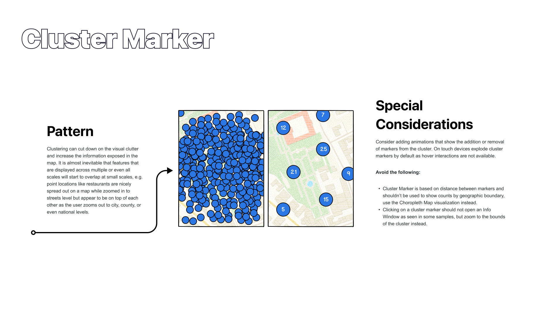
Group markers that are close to each other into clusters. These clusters typically use similar symbology as the original marker but are larger in size, often in the form of a circle with a number inside indicating the number of markers that have been consolidated into the new cluster marker. Often the diameter of the cluster marker increases proportional to the number of markers it represents.
+ Mobile web intermediate view is a format for displaying search results on a mobile device using a web browser.
+ It includes a static preview of the map at the top and a list of results.
+ The list of results will contain items, but no markers will be displayed on the static preview of the map. This approach allows users to see a general idea of the geographical area where the search results are located, but it does not provide a quick identification of the specific locations of the search results.
+ If the user clicks on the static preview, it will redirect them to the full map view, which can be implemented as an embedded map, where the markers of the specific locations of the search results will be displayed.
